As statistics educators, it is often easier to focus our teaching on methods instead of communication. And while many of us understand the value of good communication, actually teaching it is difficult and outside of our comfort zone. There has been quite a bit of work done on the science of visualization (e.g., the Grammar of Graphics by Wilkinson). There is general consensus that teaching students to communicate using visualizations is of paramount importance (see recent blog entries: National Academies Report on Data Science and GAISE). However, the connection between the work done on visualization methods and the teaching of data science and statistics is weaker.
When trying to incorporate data visualization into the classroom, we find ourselves asking the following questions:
- What does data visualization in a statistics or data science class even mean?
- How do you teach data visualization?
- What are successful and unsuccessful approaches to teaching visualization in the classroom?
- What types of assignments can you give for visualization assignments?
- How can visualization assignments be assessed effectively? efficiently?
Examples of Teaching Visualization
For inspiration, we look to our colleagues who are already implementing either full courses on data visualization or substantial sections of data visualization into their statistics or data science courses.
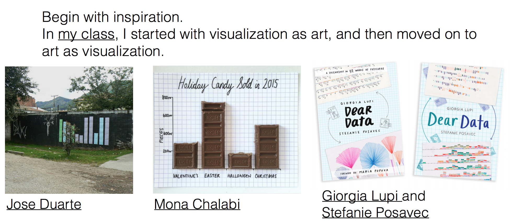
- Amelia McNamara from University of St. Thomas is a leader in teaching visualization. Her course on Communicating with Data incorporates many different aspects of visualization which are well detailed on her website.
- topics include:
plotly, color theory, graphical perception, design principles, hand-drawn visualizations, spatial data, visualizing uncertainty, and more.
- assignments include: reading responses, visualization in the wild, and a final project.
- readings include: key standards like Visualize This by Nathan Yau and The Visual Display of Quantitative Information by Edward Tufte. Other great resources are Wickham and Stryjewski 40 Years of Boxplots and Dear Data by Lupi and Posavec.
- topics include:
Nolan and Perrett’s 2016 TAS paper “Teaching and learning data visualization: ideas and assignments” provides guidance on bolstering the role of graphics in the undergraduate statistics curriculum.
Silas Bergen’s course on Data summarization and visualization (among many other aspects of the course) assigns three design tasks, representing a way of scaffolding assignments to build student competencies throughout the semester.
- Design Task #1: a single, static dashboard visualizing antibiotic data
- Design Task #2: a visualization meant to answer a series of research questions based on census data
- Design Task #3: a visualization which answers more complex research question and includes interactivity
The blog citizen-statistician provides a handful of posts which are relevant to teaching data visualization including:
In his STATS337 (“Readings in Applied Data Science”) course at Stanford, Hadley Wickham has his students create annotated bibliographies describing different aspects of data science. Kenneth Tay’s Annotated Bibliography on “Communication and Visualization in Data Science” provides context and resources for an instructor looking for ideas in teaching visualization.
The rich history of graphics and visualization is an additional venue to pursue with your students. Understanding how visualizations have played a role in scientific discoveries as well as understanding the evolution of different methods helps students
- Visual and Statistical Thinking by Tufte discusses two compelling examples where in one the graphic saved the day, and in the second, the graphic was terrible and led to disaster.
- The Golden Age of Statistical Graphics traces the origins of statistical graphics and how the last 150 years of graphics paved the way for the explosion in visualization theory and techniques seen recently. The Milestones Project by Friendly and Denis is a fun and interactive way for students to experience the evolution of graphical techniques.
Learn more
- NYT What’s Going On in This Graph
- List of Data Viz books: https://policyviz.com/better-presentations/data-viz-resources/data-viz-books/
- Even more references to visualization courses: http://civilstat.com/2015/11/teaching-data-visualization-approaches-and-syllabi/
- Online data viz text: Fundamentals of Data Visualization
- Nathan Yau, One Dataset, Visualized 25 Ways
- Mine Çetinkaya-Rundel’s 2018 Pickard Lecture describing how powerful teaching visualization in the classroom can be: Let Them Eat Cake (First)!, slides
- Nolan and Perrett Teaching and Learning Data Visualization: Ideas and Assignments, TAS 2016.
- McNamara Key Attributes of a Modern Statistical Computing Tool, TAS, 2018.
- Modern Data Science with R by Baumer, Kaplan, and Horton devotes chapters to: data visualization, the grammar of graphics, interactive data graphics, and working with spatial data. (As a textbook, MDSR provides many great examples and end of chapter exercises.)
About this blog
Each day during the summer of 2019 we intend to add a new entry to this blog on a given topic of interest to educators teaching data science and statistics courses. Each entry is intended to provide a short overview of why it is interesting and how it can be applied to teaching. We anticipate that these introductory pieces can be digested daily in 20 or 30 minute chunks that will leave you in a position to decide whether to explore more or integrate the material into your own classes. By following along for the summer, we hope that you will develop a clearer sense for the fast moving landscape of data science. Sign up for emails at https://groups.google.com/forum/#!forum/teach-data-science (you must be logged into Google to sign up).
We always welcome comments on entries and suggestions for new ones.