The American Statistical Association has placed a priority on how best to teach statistics and data science. The Guidelines for Assessment and Instruction in Statistics Education (GAISE) reports have served a key role in guiding instructors and institutions in their pedagogical choices.
Two GAISE reports have been written: one focused on statistics at the PreK-12 level and another, revised in 2016, focused on college level courses. In this GAISE blog entry we focus on the college report.
The key findings from the report remain consistent from the original GAISE report:
- Teach statistical thinking.
- Teach statistics as an investigative process of problem-solving and decision- making.
- Give students experience with multivariable thinking.
- Teach statistics as an investigative process of problem-solving and decision- making.
- Focus on conceptual understanding.
- Integrate real data with a context and purpose.
- Foster active learning.
- Use technology to explore concepts and analyze data.
- Use assessments to improve and evaluate student learning.
If you haven’t read the report now might be a good time to do so. (The appendices are also worth a read, particularly the section on assessment that has general value for both data science and statistics courses.)
Multivariate Thinking
One key change, noted in bold above, was to reinforce that statistical thinking incorporate multivariate thinking (and not just explore univariate or bivariate relationships).
Multivariate thinking is discussed as a key component of data acumen of the NASEM “Data Science for Undergraduates” report in two ways: as part of mathematical foundations and statistical foundations.
Another key change was to clarify that technology did not mean use of calculators, but instead environments that can allow students to explore using flexible and modern tools (e.g., R, Python, JMP, CODAP).
Implementing the GAISE recommendations using R
What does this mean for instructors? For me it has caused me to ensure that my students engage almost immediately with technology to start to explore multivariate relationships. Here’s an example in R (taken from the appendix of the revised college report) that explores the relationship between teacher salaries (in thousands of dollars) and SAT scores (a high-stakes college entrance exam) at the state level from the year 2010.
library(tidyverse)sat <- mdsr::SAT_2010
ggplot(sat, aes(x = salary, y = total)) + stat_smooth(method = lm) +
geom_point()
## `geom_smooth()` using formula 'y ~ x'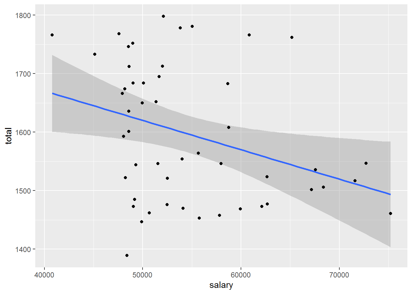
We see that there is a strong negative association between the explanatory and response variables. Should we conclude that reducing teacher salary is the best way to increase SAT scores? Not at all, it turns out, due to the role of a third variable.
The GAISE College report writes:
But the real story is hidden behind one of the “other factors” that we warn students about but do not generally teach how to address! The proportion of students taking the SAT varies dramatically between states, as do teacher salaries. In the Midwest and Plains states, where teacher salaries tend to be lower, relatively few high school students take the SAT. Those that do are typically the top students who are planning to attend college out of state, while many others take the alternative standardized ACT test that is required for their state. For each of the three groups of states defined by the fraction taking the SAT, the association is non-negative. The net result is that the fraction taking the SAT is a confounding factor.
sat <- sat %>%
  mutate(
    fracgrp = cut(sat_pct,
      breaks = c(0, 30, 60, 94),
      labels = c("low fraction", "medium fraction", "high fraction")
    )
  )
ggplot(sat, aes(x = salary, y = total, colour = fracgrp)) +
stat_smooth(method = lm) + geom_point()
## `geom_smooth()` using formula 'y ~ x'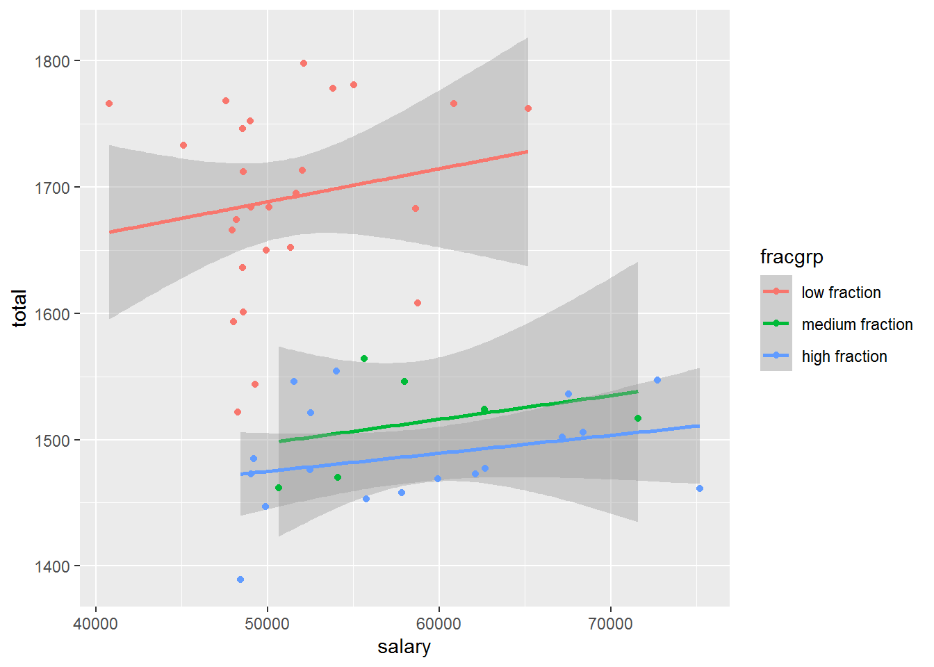
By stratifying (a simple process achieved with the ggplot() function using the colour aesthetic) we can start to disentangle the complex and interesting set of relationships seen with the SAT data. We may take a step back and start to explore each of the three pairwise relationships.
satsmall <- sat %>%
  select(salary, total, sat_pct)
GGally::ggpairs(satsmall)
## Registered S3 method overwritten by 'GGally':
##   method from
##   +.gg   ggplot2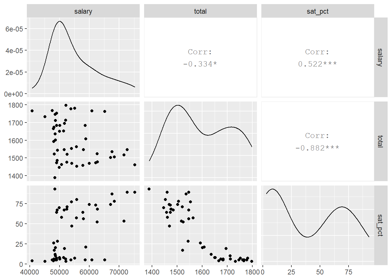
Here we see strong bivariate relationships and evidence of confounding.
We can also fit regression models to explore the relationships:
coef(lm(salary ~ total, data = sat))
## (Intercept)       total
## 90108.48337   -22.16604
coef(lm(salary ~ total + sat_pct, data = sat))
##  (Intercept)        total      sat_pct
## -15926.04951     38.22782    249.69211
The sign of the coefficient for total SAT score has flipped which is described by Simpson’s Paradox.
In my courses I’ve often had my students engage on day one in an activity to explore multivariate relationships (see the Data Viz on Day One paperhttps://escholarship.org/uc/item/84v3774z)
Key take home message
For me, the important take home message here is that design matters. When analyzing observational data it’s critical to understand where the data came from, what factors (measured or otherwise) are relevant for our analysis, the role of domain knowledge, and most importantly, how to combine all of these to avoid making incorrect conclusions. No formal inference was undertaken here (or necessary: the data are a census of all states) but the implications are clear: we would make an incorrect conclusion about the relationship between salary and SAT scores using the first figure. We need to dig a little deeper to better understand the relationships.
We think that it is critical for students and instructors to move beyond “correlation does not imply causation”. By using techniques such as stratification or multiple regression students in statistics and data science courses can move beyond two group comparisons. In later courses, we can start to deepen understanding of confounding and causal inference (listed as key components of statistical foundations in the NASEM “Data Science for Undergraduates” report).
Learn more
- GAISE College report: https://www.amstat.org/asa/education/Guidelines-for-Assessment-and-Instruction-in-Statistics-Education-Reports.aspx
- Updated guidelines, updated curriculum: https://arxiv.org/abs/1705.09530
- Kari Lock Morgan Multivariate thinking slides from JSM 2018: https://github.com/Amherst-Statistics/JSM2018
- Shiny App: confounding and the SAT: https://r.amherst.edu/apps/nhorton/sat-ggplot/
- Teaching Statistics (a bag of tricks): http://www.stat.columbia.edu/~gelman/bag-of-tricks/
- Data Viz on Day One: https://escholarship.org/uc/item/84v3774z
About this blog
Each day during the summer of 2019 we intend to add a new entry to this blog on a given topic of interest to educators teaching data science and statistics courses. Each entry is intended to provide a short overview of why it is interesting and how it can be applied to teaching. We anticipate that these introductory pieces can be digested daily in 20 or 30 minute chunks that will leave you in a position to decide whether to explore more or integrate the material into your own classes. By following along for the summer, we hope that you will develop a clearer sense for the fast moving landscape of data science. Sign up for emails at https://groups.google.com/forum/#!forum/teach-data-science (you must be logged into Google to sign up).
We always welcome comments on entries and suggestions for new ones.