For many statisticians, their go-to software language is R. However, there is no doubt that Python is an equally important language in data science. Indeed, the Jupyter blog entry from earlier this week described the capacities of writing Python code (as well as R and Julia and other environments) using interactive Jupyter notebooks.
knitr::opts_chunk$set(collapse = TRUE)
library(reticulate)
use_virtualenv("r-reticulate")
use_python("F:/Anaconda3", required = TRUE)
py_config()
Teaching Python and R
A quick google search can quickly bring up many arguments on both sides of the heated Python vs R debate. We don’t take sides in that conversation, but we do recognize that teaching students about both Python and R can give them insight into both languages and more skills for doing data science in the wild. A previous blog entry on Jupyter discussed running Python code in its native environment. [n.b., Jupyter is a portmanteau combining Julia, Python, and R; Jupyter notebooks are able to run R code, too.] Below, we discuss running Python in the R Markdown environment. Whatever computational environment is used to execute instructions to the computer, it can be illuminating for students to see different implementations of the same syntax producing the same results, or alternatively, implementation of different syntax producing the same result. The more students can think broadly and confidently about their skill set, the more impact they will have in performing data analyses.
Below we’ve provided a series of examples in markdown chunks (both Python chunks and R chunks). While there is a lot of repeated code, we included all the details for those of you who might be working with Python in R for the first time. Those of you who are familiar with chunks in different styles should easily be able to skim through the data wrangling.
Python in R
Using pandas you can import data and do any relevant wrangling (see our recent blog entry on pandas). Below, we’ve loaded the flights.csv dataset, specified that we are only interested in flights into Chicago, specified the three variables of interest, and removed all missing data.
In R, full support for running Python is made available through the reticulate package. Chunks are specified to be a Python chunk (which indicates that R is running Python). Below we provide the syntax of how the chunk looks in a Markdown file:
```{python}
import pandas
flights = pandas.read_csv("flights.csv")
flights = flights[flights["dest"] == "ORD"]
flights = flights[['carrier', 'dep_delay', 'arr_delay']]
flights = flights.dropna()
```
The Python chunk which is actually run:
import pandas
flights = pandas.read_csv("flights.csv")
flights = flights[flights["dest"] == "ORD"]
flights = flights[['carrier', 'dep_delay', 'arr_delay']]
flights = flights.dropna()
Indeed, you might want to learn a little bit about the dataset using Python commands. Again, we first provide the syntax, then we run the chunk in Markdown.
```{python}
flights.shape
flights.head(5)
flights.describe()
```
flights.shape
## (12590, 3)
flights.head(5)
## carrier dep_delay arr_delay
## 4 UA -4.0 12.0
## 5 AA -2.0 8.0
## 22 AA -1.0 14.0
## 34 AA -4.0 4.0
## 43 UA 9.0 20.0
flights.describe()
## dep_delay arr_delay
## count 12590.000000 12590.000000
## mean 11.709770 2.917951
## std 39.409704 44.885155
## min -20.000000 -62.000000
## 25% -6.000000 -22.000000
## 50% -2.000000 -10.000000
## 75% 9.000000 10.000000
## max 466.000000 448.000000Or you might be interested in doing some computations on the dataset:
```{python}
flights = pandas.read_csv("flights.csv")
flights = flights[['carrier', 'dep_delay', 'arr_delay']]
flights.groupby("carrier").mean()
```
flights = pandas.read_csv("flights.csv")
flights = flights[['carrier', 'dep_delay', 'arr_delay', 'month']]
flights.groupby("carrier").mean()
## dep_delay arr_delay month
## carrier
## AA 8.586016 0.364291 6.481683
## AS 5.804775 -9.930889 6.414566
## DL 9.264505 1.644341 6.574766
## UA 12.106073 3.558011 6.561766
## US 3.782418 2.129595 6.551568For comparison, notice how an R chunk is specified to run R code. The R code uses dplyr to find the group averages from the data that was wrangled using pandas in Python. Arguably, one of the most important aspects of the code below is the command which pulls the dataset from the Python chunk into the R chunk. Notice that the dataset is now called py$flights.
```{r}
library(dplyr)
py$flights %>%
  dplyr::select(carrier, dep_delay, arr_delay) %>%
  tidyr::drop_na() %>%
  group_by(carrier) %>%
  summarize(mean_dep_delay = mean(dep_delay), mean_arr_delay = mean(arr_delay))
```
library(dplyr)
py$flights %>%
dplyr::select(carrier, dep_delay, arr_delay) %>%
tidyr::drop_na() %>%
group_by(carrier) %>%
summarize(mean_dep_delay = mean(dep_delay), mean_arr_delay = mean(arr_delay))
## # A tibble: 5 x 3
## carrier mean_dep_delay mean_arr_delay
## <chr> <dbl> <dbl>
## 1 AA 8.57 0.364
## 2 AS 5.83 -9.93
## 3 DL 9.22 1.64
## 4 UA 12.0 3.56
## 5 US 3.74 2.13We can also use ggplot2 to plot the data from the Python chunk. Maybe it’s better to avoid flying in the summer or in December.
library(ggplot2)
py$flights %>%
  tidyr::drop_na() %>%
  group_by(carrier, month) %>%
  summarize(mean_dep_delay = mean(dep_delay)) %>%
  ggplot(aes(x=as.factor(month), y = mean_dep_delay, group = carrier, color=carrier))  +
  geom_point() + geom_line() + xlab("Month") + ylab("Average Departure Delay")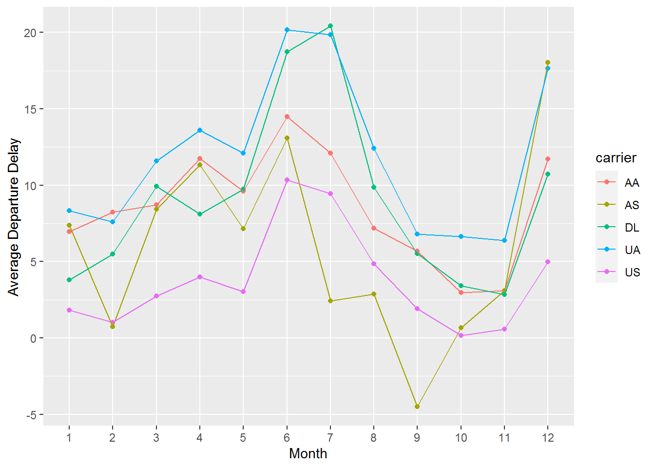
R in R
Seems worth a comparison of doing exactly the same thing using native R syntax. In this case, we’ve written everything in R, so we won’t show you the verbatim R chunks.
library(dplyr)
library(readr)
library(tidyr)
flights <- readr::read_csv("flights.csv")
flights <- flights %>%
  dplyr::filter(dest == "ORD") %>%
  dplyr::select(carrier, dep_delay, arr_delay) %>%
  tidyr::drop_na()
library(skimr)
flights %>% dim()
## [1] 12590 3
flights %>% head(5)
## # A tibble: 5 x 3
## carrier dep_delay arr_delay
## <chr> <dbl> <dbl>
## 1 UA -4 12
## 2 AA -2 8
## 3 AA -1 14
## 4 AA -4 4
## 5 UA 9 20
flights %>% skimr::skim()| Name | Piped data |
| Number of rows | 12590 |
| Number of columns | 3 |
| _______________________ | |
| Column type frequency: | |
| character | 1 |
| numeric | 2 |
| ________________________ | |
| Group variables | None |
Variable type: character
| skim_variable | n_missing | complete_rate | min | max | empty | n_unique | whitespace |
|---|---|---|---|---|---|---|---|
| carrier | 0 | 1 | 2 | 2 | 0 | 2 | 0 |
Variable type: numeric
| skim_variable | n_missing | complete_rate | mean | sd | p0 | p25 | p50 | p75 | p100 | hist |
|---|---|---|---|---|---|---|---|---|---|---|
| dep_delay | 0 | 1 | 11.71 | 39.41 | -20 | -6 | -2 | 9 | 466 | ▇▁▁▁▁ |
| arr_delay | 0 | 1 | 2.92 | 44.89 | -62 | -22 | -10 | 10 | 448 | ▇▁▁▁▁ |
flights <- readr::read_csv("flights.csv")
flights %>%
  dplyr::select(carrier, dep_delay, arr_delay) %>%
  tidyr::drop_na() %>%
  group_by(carrier) %>%
  summarize(mean_dep_delay = mean(dep_delay), mean_arr_delay = mean(arr_delay))
## # A tibble: 5 x 3
##   carrier mean_dep_delay mean_arr_delay
##   <chr>            <dbl>          <dbl>
## 1 AA                8.57          0.364
## 2 AS                5.83         -9.93
## 3 DL                9.22          1.64
## 4 UA               12.0           3.56
## 5 US                3.74          2.13
Same plot as above. Note, however, that we are calling the flights data directly from an R chunk to an R chunk, so there is no need to provide additional formatting to the name of the dataset (above we needed to specify py$flights).
library(ggplot2)
library(dplyr)
flights %>%
  tidyr::drop_na() %>%
  group_by(carrier, month) %>%
  summarize(mean_dep_delay = mean(dep_delay)) %>%
  ggplot(aes(x=as.factor(month), y = mean_dep_delay, group = carrier, color=carrier))  +
  geom_point() + geom_line() + xlab("Month") + ylab("Average Departure Delay")
Learn more
- RStudio R Interface to Python
- RStudio blog on Reticulated Python
- Blog entry on Jupyter Notebooks
- Blog entry on pandas
About this blog
Each day during the summer of 2019 we intend to add a new entry to this blog on a given topic of interest to educators teaching data science and statistics courses. Each entry is intended to provide a short overview of why it is interesting and how it can be applied to teaching. We anticipate that these introductory pieces can be digested daily in 20 or 30 minute chunks that will leave you in a position to decide whether to explore more or integrate the material into your own classes. By following along for the summer, we hope that you will develop a clearer sense for the fast moving landscape of data science. Sign up for emails at https://groups.google.com/forum/#!forum/teach-data-science (you must be logged into Google to sign up).
We always welcome comments on entries and suggestions for new ones.